Animation performance advice can start to feel like superstition: use transform not width, never animate height, avoid layout triggers. The rules are real – but without knowing why, you’re just hoping they cover your situation. Eventually, they won’t.
Tools like (Framer) Motion and GSAP help a lot. But they can’t fix a misunderstood rendering pipeline. This is an interactive guide to how browsers actually handle animations, where the real costs hide, and how to outmaneuver them. Let’s get into it!
This post is heavy on animations and interactive demos. For the best experience, view this post on a wider screen like tablet or desktop.
Flip Book
Every silky smooth motion is just a rapid sequence of still images, like a digital flipbook. The faster you flip, the smoother it looks.
On screen, each of those images is a frame drawn by the browser. At 60 FPS, you have 16.7 ms to render each one, in 120 FPS, you have 8.3 ms. Miss that budget and you drop a frame. Drop enough frames and the animation feels janky.
The Pixel Rendering Pipeline
Every frame goes through a series of stages inside the browser. Triggering an earlier stage cascades into everything that follows, so the stage you hit determines the cost you pay.
Worth burning into your brain: if you trigger Layout, you also pay for Paint and Composite. But if you only trigger Composite - via transform or opacity, you skip the expensive stuff entirely. This one rule explains most of the advice in this post.
Shadow Boxing
Some animations look simple but are quietly expensive. Can we use the pipeline to outsmart them?
Consider box-shadow animations. Each frame of a box-shadow transition triggers Paint → Composite. Shadow calculations and Gaussian blur get re-executed on every single frame.
1/* Usual solution */2/* triggers Paint → Composite every frame */3
4.card {5  transition: box-shadow 0.3s ease;6}7
8.card:hover {9  box-shadow: 0 10px 20px rgba(0,0,0,0.2);10}
Here’s a more efficient approach: pre-render the shadow on a pseudo-element and animate its opacity from 0 to 1. This skips the Paint stage entirely and goes straight to Composite.
1/* GPU-accelerated solution */2/* triggers only Composite */3
4.card {5  position: relative;6}7
8.card::after {9  content: '';10  position: absolute;11  inset: 0;12  opacity: 0;13  border-radius: 8px;14  box-shadow: 0 0 30px rgba(251, 191, 36, 0.6);15  transition: opacity 0.3s ease-in-out;16}17
18.card:hover::after {19  opacity: 1;20}
Let’s see them in action.
Open DevTools and hover over the boxes above. The Performance panel will reveal green paint timing bars similar to the emulation. Fewer bars, better performance.
This trick isn’t just for shadows. The same pattern applies to any expensive-to-paint effect: gradients, glows, complex borders. Pre-render it on a pseudo-element, then animate opacity.
Layer Cake
When transform and opacity skip paint, where does the work actually happen? The GPU. The browser breaks your DOM into composite layers, stored as textures in GPU memory, and lets the GPU composite them together. These layers are managed in a 3D space, allowing properties like transforms, opacity, and filters to be processed directly by the GPU.
To see this in action, check out the interactive inspector below, which demonstrates how browsers handle layer compositing.
Think of it like a Photoshop document. The browser separates your page into layers, hands them to the GPU as flat textures, and the GPU stamps them together every frame. Three stages:
Browser Stage: Identifies elements that need their own compositing layers: things with blur effects, transforms, opacity, and so on.
GPU Stage: Each element becomes a texture uploaded to GPU memory. Simpler shapes cost less; glass effects and large blurred surfaces cost more.
Final Output: The GPU composites all layers in the correct order, applying transformations and effects.
This demo is an emulation. Actual GPU impact varies by browser, device, and implementation.
Each promoted layer holds a texture in GPU memory. Promote too many and you hit memory pressure, especially on mobile, where this causes stutters that are invisible on your dev machine.
Use will-change strategically: apply it just before the animation starts and remove it as soon as it ends.
1// Apply just before the animation starts2element.addEventListener('mouseenter', () => {3  element.style.willChange = 'transform, opacity';4});5
6// Remove once the animation is complete7element.addEventListener('transitionend', () => {8  element.style.willChange = 'auto';9}, { once: true });
FLIP It
What about animating things that change layout, like expanding a card or reordering a list? Animating width, height, or top/left directly triggers Layout on every frame.
FLIP (First Last Invert Play) solves this. Measure where an element is and where it’s going, then use transform to fake the starting position and animate back to the final one. The layout calculation happens exactly once; the rest is compositor-only.
1const ref = useRef(null);2const firstRect = useRef(null);3const [trigger, setTrigger] = useState(0);4
5function onMove() {6  // First: record position before the change7  firstRect.current = ref.current.getBoundingClientRect();8
9  // Last: commit the layout change via state, then bump trigger10  setPosition(p => p === 'A' ? 'B' : 'A');11  setTrigger(t => t + 1);12}13
14// Invert + Play: runs after React commits new position to the DOM, before paint15useLayoutEffect(() => {16  if (!firstRect.current || !ref.current) return;17  const first = firstRect.current;18  const last = ref.current.getBoundingClientRect();19  firstRect.current = null;20
21  const dx = first.left - last.left;22  const dy = first.top - last.top;23
24  ref.current.animate([25    { transform: `translate(${dx}px, ${dy}px)` },26    { transform: 'translate(0, 0)' }27  ], { duration: 500, easing: 'ease-out' });28}, [trigger]);
The layout change happens instantly (so we can measure the final position), then the entire visible animation runs purely via transform with no repeated Layout calls.
In practice, (Framer) Motion’s layout prop handles all of this for you! But now you know exactly why it’s fast.
Scroll-Driven Animations
A super common pattern: animate something as the user scrolls, like a progress bar, an element fading in, or a parallax effect or the new Apple launch page. Instinctively most engineers reach for a scroll event listener and update styles in JS. The problem is this runs on the main thread, and if anything else is happening, frames get dropped.
CSS Scroll-Driven Animations let you tie an animation directly to scroll position in CSS. No JS needed, no event listeners. When the animated properties are transform or opacity, the browser can run the whole thing on the compositor thread, without main thread involvement.
1/* A scroll-progress bar, no JavaScript required */2@supports (animation-timeline: scroll()) {3  .progress-bar {4    position: fixed;5    top: 0;6    left: 0;7    height: 4px;8    background: #6366f1;9    transform-origin: left;10    animation: grow-bar auto linear;11    animation-timeline: scroll();12  }13
14  @keyframes grow-bar {15    from { transform: scaleX(0); }16    to   { transform: scaleX(1); }17  }18}
Compare that to the JS equivalent, which fires on every scroll event on the main thread:
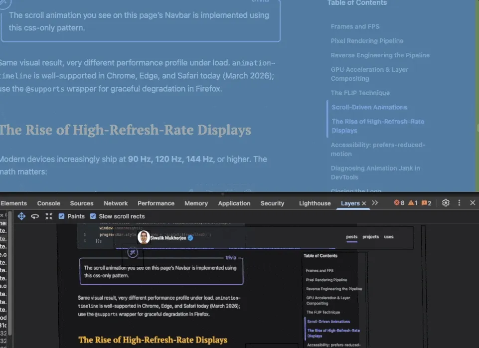
1window.addEventListener('scroll', () => {2 const scrolled = window.scrollY / (document.body.scrollHeight - window.innerHeight);3 progressBar.style.transform = `scaleX(${scrolled})`;4});The scroll animation you see on this page’s Navbar is implemented using this css-only pattern.
Same visual result, very different performance profile under load. animation-timeline is well-supported in Chrome, Safari and other major browsers but still experimental in Firefox at the time of writing; use the @supports wrapper as a progressive enhancement safety net for such cases.
120Hz Problems
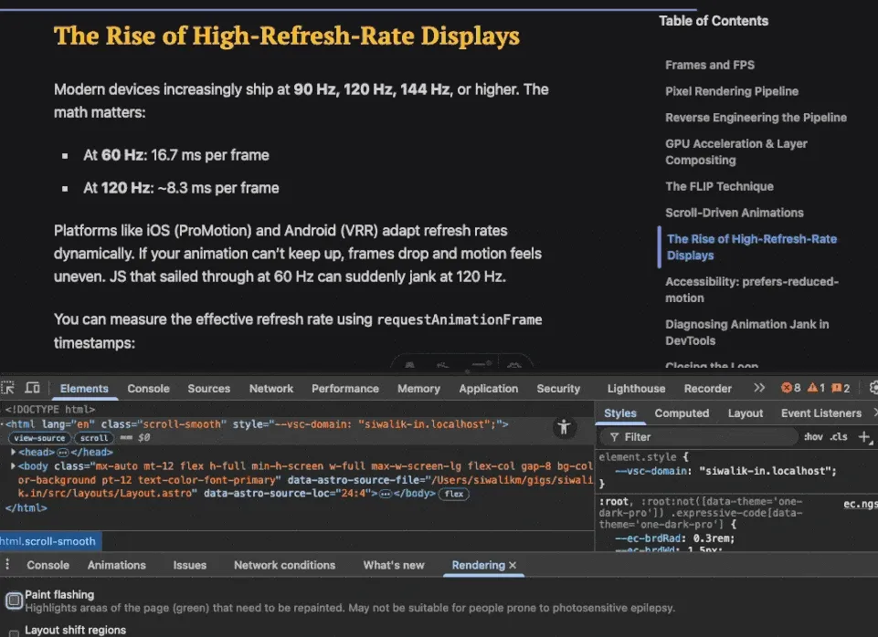
Modern devices increasingly ship at 90 Hz, 120 Hz, 144 Hz, or higher. The math matters:
- At 60 Hz: 16.7 ms per frame
- At 120 Hz: ~8.3 ms per frame
Platforms like iOS (ProMotion) and Android (VRR) adapt refresh rates dynamically. If your animation can’t keep up, frames drop and motion feels uneven. JS that sailed through at 60 Hz can suddenly jank at 120 Hz.
You can measure the effective refresh rate using requestAnimationFrame timestamps:
1let lastTime = performance.now();2
3requestAnimationFrame(function measure(time) {4  const delta = time - lastTime;5  console.log(`Frame delta: ${delta.toFixed(1)}ms (~${Math.round(1000 / delta)} Hz)`);6  lastTime = time;7  requestAnimationFrame(measure);8});
Test on high-refresh devices when possible. Even with CPU throttling, watching frame deltas will reveal timing sensitivity that your average dev machine hides.
prefers-reduced-motion
Not every user wants motion. Some have vestibular disorders where animations cause real physical discomfort. prefers-reduced-motion is both good UX and, increasingly, a legal accessibility requirement.
1@media (prefers-reduced-motion: reduce) {2 *, *::before, *::after {3 animation-duration: 0.01ms !important;4 transition-duration: 0.01ms !important;5 }6}For JS-driven animations:
1const prefersReduced = window.matchMedia('(prefers-reduced-motion: reduce)').matches;2
3if (!prefersReduced) {4  element.animate([/* ... */], { duration: 300 });5}
Josh Comeau has a reusable useReducedMotion hook worth bookmarking.
One nuance worth knowing: reduce doesn’t always mean remove. Some users rely on motion cues to understand UI state changes: a sidebar sliding in, a dialog appearing. The goal is to reduce intensity and duration, not strip all motion away.
@starting-style (Baseline 2024) lets you define entry animations that work without JS or class-toggling hacks, and they naturally respect prefers-reduced-motion when combined with the pattern above.
Jank Hunting
When I can feel something’s wrong but can’t explain why, I open DevTools and check three things:
1. Paint Flashing(More Tools → Rendering → Paint flashing):
Highlights regions being repainted every frame. If a large area flashes green during a hover animation, you’re likely hitting the box-shadow/gradient trap from earlier.
2. Layers Panel (More Tools → Layers):
Shows every compositing layer as a 3D visualization with memory cost. If you see dozens of layers on a simple page, something is over-promoting.
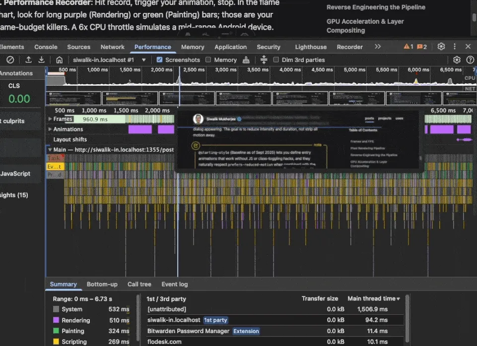
3. Performance Recorder:
Hit record, trigger your animation, stop. In the flame chart, look for long purple (Rendering) or green (Painting) bars; those are your frame-budget killers. A 6x CPU throttle simulates a mid-range Android device.
Closing the Loop
If you’re only taking a few things away from this, make it these:
- Prefer
transform+opacityfor continuous motion. - Avoid layout-triggering properties (
width,top/left) while animating, use transforms or a library like Motion which use FLIP technique and skip per-frame Layout entirely. - Promote layers intentionally; clean up
will-changeafter animation. - For scroll effects, try
animation-timelinebefore reaching for a JS scroll listener. - Test on high-refresh and mid-range mobile; they surface problems desktops hide.
- Respect
prefers-reduced-motion.
The rendering pipeline isn’t just animation trivia, it’s a map. Once you know what Layout, Paint, and Composite actually cost, you stop guessing and start reasoning. That changes how you write CSS, how you review PRs, and what you reach for first when something feels off.
Pick one interaction this week. Profile it, trace it through the pipeline, and swap one property. The gap between a janky and a fluid experience is usually smaller than you think.
If this was useful, share it with someone shipping animations. And if you have a favourite technique I missed, let me know on BlueSky or Twitter.
Relevant Reads
If you want to go deeper, here are some reads that expand on the topics I barely touched.
- Rendering Performance (web.dev) - excellent primer on pipeline stages and frame budgets. The authors also have a free course on Udemy which you’ll have a lot of fun learning.
- Scroll-Driven Animations (Chrome for Developers)
- FLIP Your Animations (Aerotwist) - the original FLIP writeup by Paul Lewis
- 120fps and no jank (Surma) - why high-refresh fundamentally tightens budgets
- GPU Accelerated Compositing in Chrome from chromium.org
- CSS JS Animation Performance Guide by mozilla.org